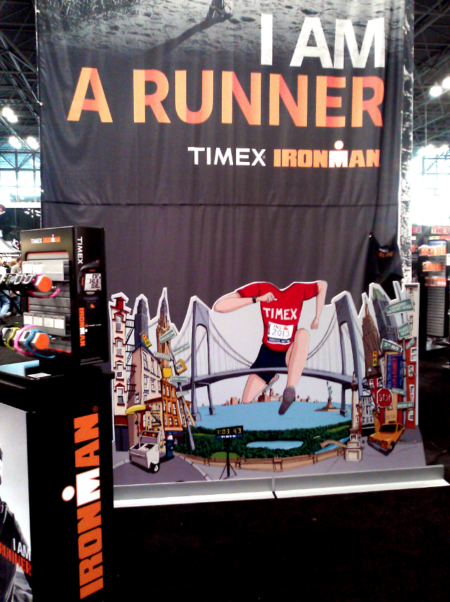
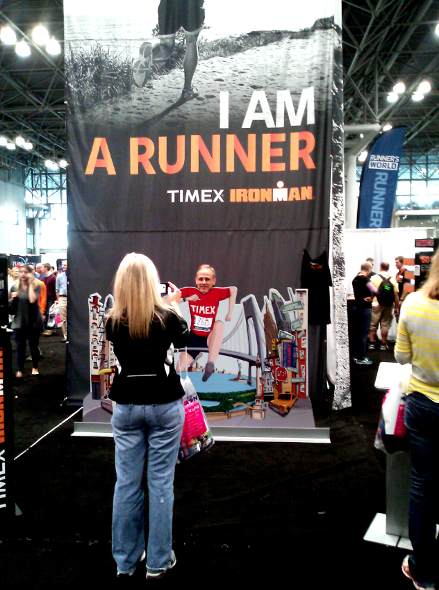
Timex NYC Marathon Mural
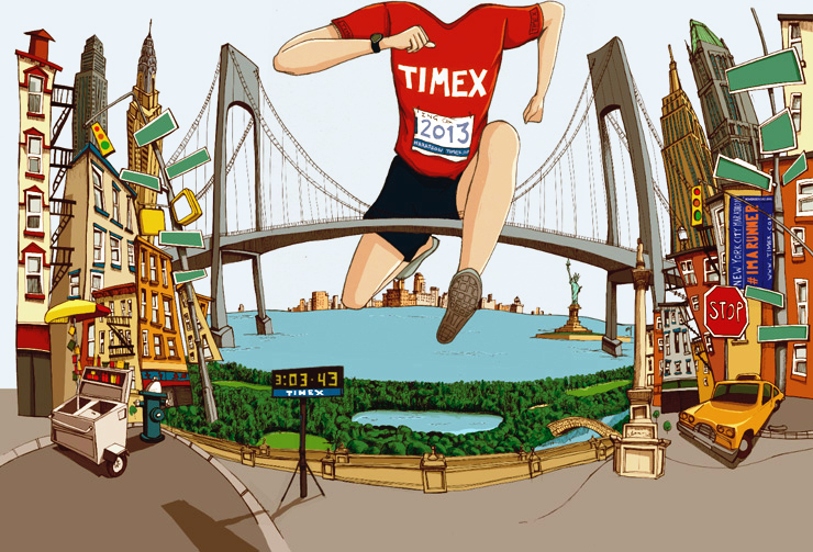 When Timex rang me up recently to ask if I’d be interested in working with them to create a one off large scale illustration for their booth at the 2013 NYC Marathon Expo I was understandably excited.
It was a great project to work on in which I was given free reign to just do my thing. I’ll start with showing the final piece before I take a step backwards and show you the process.
The Brief
The brief for this project was pretty straightforward. They wanted to find a way for people to interact with their booth at the expo and so they wanted me to create a large illustration to be recreated as a mural. The idea was for folks to pose behind it as the runner.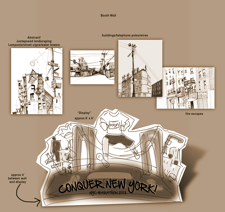
After receiving basic layout suggestions from the client, I was free to go ahead and sketch out various compositional ideas. The tricky part about trying to represent a place like New York is not knowing what to include but what to leave out.
Sketching Ideas
This was the first intial sketch…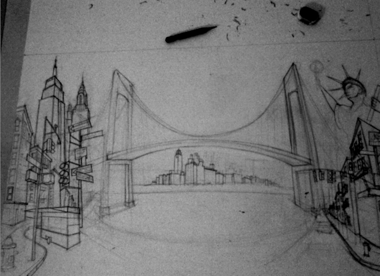
After reviewing with the client, we decided that the piece would benefit from a much looser drawing style so with that in mind we pushed on.
This was a first. Having to be more like myself. In retrospect, it’s possible that my urge to do a great job on this one had initially tensed me up slightly and taken some of the spontaneity out of the drawing. Still, no harm done, that’s why it’s so important to maintain a constant level of communication between a client throughout a project or things like this might get missed until it’s too late.
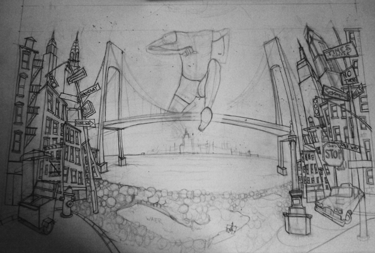
This was much more like it!
The juxtaposed buildings really helped to create a sense of energy and vibrancy within the illustration. Something that is a must when attempting to depict a place like New York.
Inking
With the pencil stage now approved, it was time to create the ink version.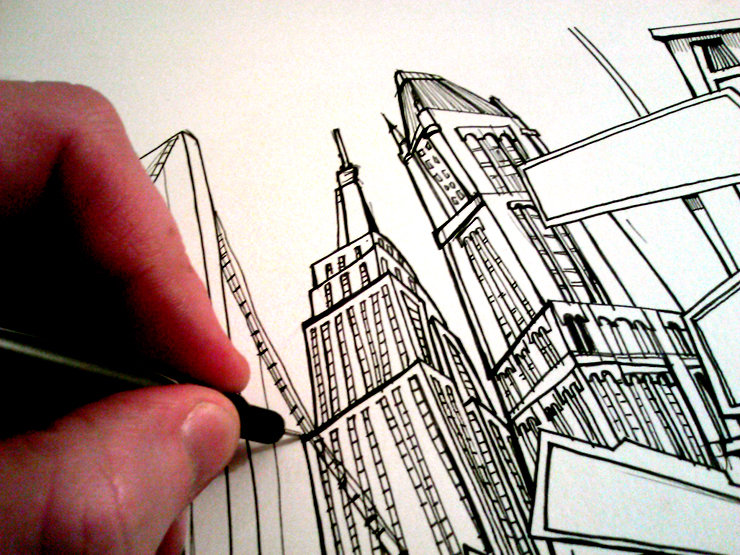
Inking, inking and more inking.
Usually when creating these types of illustrations, I’ll just skip the pencil stage altogether and just draw solely in pen and ink but in this situation where there is always going to be a review stage, pencil is a must.
Taking it Digital
With the ink stage now complete, time for color(or “colour” depending on what side of the atlantic you reside.)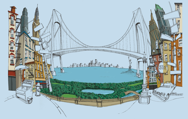
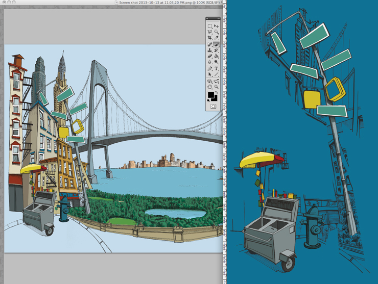
This file got so enormous, it pushed my trusty imac to the limits. Luckily, things held together and I pushed on towards the finishing line. Everything came together perfectly and both myself and client were delighted with the results.
The Final Result
Closing Thoughts
What was interesting about this project was how I initially tensed up in the early stages before having to take a looser approach. This was a reminder to myself to always be your self regardless of the size of the job. Otherwise, you could run the risk of merely delivering a project that doesn’t reflect your own strengths, and omitting what attracted the client to your work in the first place.
Stand tall, be outstanding and above all, be you.
Getting to work with a company like Timex was a real bonus. Another bonus is that they’ve now hired me again to recreate the piece for the London marathon in 2014.
Last but not least, a big thank you to Michael Muligano and the rest of the creative team at Timex for being so great to work with and so enthusiastic about the process throughout.

